Taking Great Screenshots in Mac OS X
Kirk McElhearn January 28, 2007 Tutorials Mac
While most people, when they think about writing tutorials, focus on the actual writing—the words, sentences, paragraphs and overall structure—the graphics and screenshots you use in tutorials are just as important. While the old saw which says that, “a picture is worth a thousand words” may be an exaggeration, screenshots in technical documentation can not only give users more information than words may provide, but they may also be much more efficient. Showing a user what a window, menu, or dialog looks like rather than attempting to describe it can help the reader negotiate even the most complicated technical instructions. In addition, screenshots serve as a form of visual punctuation; they provide a respite from the written words, and act as a pause in what may be complicated writing.
The first thing you need to do is choose the appropriate tool for taking screenshots. For Mac OS X, the tool of choice is Ambrosia’s Snapz Pro. While you can use Mac OS X’s built-in screenshot tool, Snapz Pro offers many more options: a choice of file formats, the ability to display or hide the cursor, and the program gives you more flexibility in naming files and in choosing locations to save them.
Once you’re ready to go, begin by considering what you show your reader: to avoid confusion, you should always use a default user environment. It is common to see documentation or tutorials illustrated with screenshots that will confuse inexperienced users. They may have extraneous menu extras; the dock may not be in the standard position, and may contain a dozen or more extra icons: there may be icons all over the desktop, which also has a strange background; or Finder window sidebars may contain a menagerie of unexpected icons.
The best way to prepare for screenshots is to create a virgin user account. You should never have any elements visible in this environment that are not part of the default Mac OS X installation, unless they have been installed by the software that you are talking about. Not only can these items be distracting, but they may also be confusing; you readers may not know where they came from, and they may expect these elements to be part of the software that you are discussing. You can certainly make changes in the environment as necessary to describe the software—for example, if you are discussing how to customize the Finder, you would naturally want your screenshots to reflect the changes you make as you write your documentation. So at the beginning of a tutorial about the Finder, it would look as it does after you first install Mac OS X. But as you progress, each subsequent screenshot would reflect changes you have made in your tutorial. Or, for any software that installs its own elements, such as menu extras, icons or contextual menu items, you want to see these elements when necessary.
If you cannot do this, you can always modify your screenshots. Image editing software, such as Adobe Photoshop, lets you cut out elements that aren’t necessary. You can easily remove menu extras and other elements, as well as blur any user-specific data (such as your IP address, for example) that you don’t want to show.
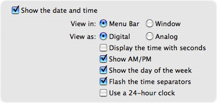
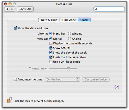
As you take screenshots, you need to consider what elements must be included in these images. If you are merely discussing the contents of a single window, you don’t need to take a screenshot of the entire screen. Nor do you need to take a screenshot that shows multiple windows. If you are discussing the options in a given dialog, only shoot that dialogue; you don’t even need the background to appear. If you are looking at a specific part of a window—say, a checkbox or radio button next to some text—you can take a screenshot of just that region, including only the checkbox and its text, or, if several texts are related, a larger area.

As you can see in the above example, I have taken a screenshot of part of the Clock tab of the Date & Time preference pane in System Preferences; if I were discussing the menu bar clock settings, I wouldn’t need the entire window.
Another thing to consider is how you determine which kind of border to use. In the previous example, I used Snapz Pro’s “fade to white” border setting; I find that for regions, this is more attractive. When I shoot entire windows, I use a drop shadow:

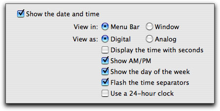
Since this is how windows appear on a Mac, there’s no reason to not use these borders. Also, they look cool; screen shots with drop shadows stand out from the background. However, using a region screenshot with a drop shadow simply looks like a mistake:

Users will never see anything that looks like the above example, so don’t use this type of border.
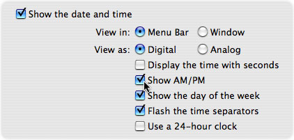
Sometimes, it helps to include the cursor in your screenshot. This can be very useful if your screenshot shows several buttons, checkboxes or radio buttons, and you are telling the reader to check a specific item. Including the cursor at the location where it must be in order to check this item allows the reader to more easily spot what you are referring to.

However, if the cursor is not necessary for a screenshot, you should simply not include it at all. I often see documentation with sloppy screenshots where cursors appear in odd locations simply because the person taking the screenshots didn’t pay any attention to it.
Unless you’re writing for print media—books and magazines—use as many screenshots as you need. While books generally allow you to be flexible, magazines often limit you to one or two screen shots per article. However, if you’re writing for the Web, use as many screenshots as you think the reader will need to understand what you are writing about. Remember, screenshots are both illustrations and visual punctuation. Your readers don’t know as much as you do, which is why they’re reading your documentation, so any visual aids will make your tutorials easier to understand.
When you insert screenshots in your texts, make sure that they are appropriate for the context; they should clearly illustrate what you were talking about. Some people prefer putting screenshots before the text explaining them, but I find that screenshots make more sense coming just after the text discussing what they illustrate. (If you are using captions, the location of screenshots can be more flexible because the captions are attached to the graphics.) Don’t be afraid of using short paragraphs followed by screenshots. Ideally, each time you describe an element that needs to be illustrated, you should follow it with a screenshot and then start a new paragraph.
The best way to learn how to efficiently use screenshots is by writing some documentation and working with screenshots. Try writing a tutorial with no screenshots at all and see how difficult it can be to describe every detail. Then, rewrite the same tutorial using as many screenshots as you need; see how many fewer words you can use, and how much clearer the tutorial is. With this in mind, pay attention to documentation you read, whether it be users’ manuals, tutorials, or articles on the web. See how other writers use screenshots, and learn from their examples. Not everything will be correct, of course, but as you read, try to figure out whether the documentation would be clearer with more screenshots. In the end, what counts is how well readers understand you. Screenshots are an essential part of any software documentation, and one that should never be neglected. Your tutorials will be clearer, more useful, and your readers will come back for more.
Related Articles
Subscribe to our email newsletter
Sign up and get Macinstruct's tutorials delivered to your inbox. No spam, promise!